Travelling as a Family
After a stay in a hotel that wasn’t as kid’s friendly as we had thought, my husband and I came up with the idea of a blog that would include good addresses for families. That’s how Made for Families was born.

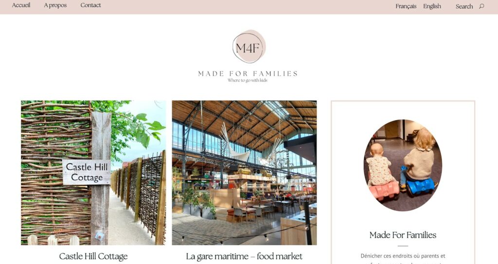
I create websites and I have a journalism background, I have all the skills required. So it was just a matter of getting to work. I quickly put this project on my agenda. The challenge was to design a blog that reflected our image. After designing a visual identity (a logo, a colour scheme, two main fonts, … I’m not a graphic designer but I have some tools that can help when you’re starting out), I set up the site. We wanted a simple blog, which leads to information quickly and which is pretty. And as the concept is to take up places that appeal to both parents and children, we avoided the childishness that our subject could imply.
We had to adapt a few elements, make all kinds of tests to obtain a result that suited us both. Then I started to work on the content. I wrote each of the articles in two languages (French and English): since we were talking about hotels abroad, we wanted to be able to send them the link in a language they could understand…
It’s been online for a few months now and we’re still having fun with it. I’ll let you see it for yourselves…


Leave a Reply